

Homeowners who like updating their interiors frequently look for ways to incorporate popular colours into their rooms without going overboard. Many begin with modest elements, such as light blue wall panels, and then expand these concepts to other spaces. Although trends can be attractive, it can be challenging to use them tastefully so the home feels cohesive and unique rather than overfurnished. Colour trends can retain enduring style while enhancing character and mood with careful planning.
Beginning With a Balanced Foundation
Trend-driven colours can be highlighted with a solid base without overwhelming the space. This base is easily achieved with soft neutrals such as cream, warm grey, pale beige, or off-white. Stronger colours can play supporting roles rather than compete for attention, thanks to their controlled quality. Homeowners can begin layering brighter or bolder tints in areas that benefit from contrast once the foundation is solid.
Using Accent Walls to Introduce Trendy Hues
Accent walls offer a controlled way to experiment with colour trends. They enhance the space with a single, visually striking moment that doesn’t require whole dedication. Rich browns, earthy greens, and pastel blues look great on feature walls, especially when combined with décor that reflects their undertones. When used sparingly, bright coral, mustard yellow, and deep teal also produce striking visual statements. This focused strategy encourages new ideas while preserving sophistication.
Incorporating Wall Panels for Depth and Texture
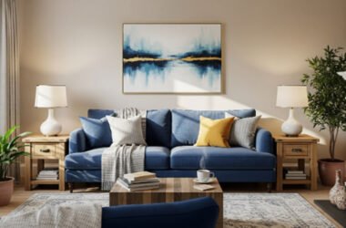
Wall panels offer a special chance to blend texture and colour. Their structure achieves a dimension that paint alone cannot. While sage, clay brown, or subdued pink wall panels add warmth and softness, light blue panels provide tranquillity to areas that require clarity. Vibrant colours like cobalt blue or cherry red work well in creative spaces where expressive hues are comfortable. Panels enhance the flow between colour stories and help define transitions, whether they are placed in living rooms or hallways.
Choosing Pastel Tones for Subtle Impact
Pastel colours produce soft settings that work well in quiet spaces, study spaces, and bedrooms. A subtle yet contemporary look is provided by light blue, pastel mint, soft peach, and delicate lavender. These colours complement basic décor, wooden furniture, and natural textiles. Using pastels in subtle elements such as low-height panels, alcoves, or trim adds interest without sacrificing serenity. Because of their suppleness, rooms can feel modern without sacrificing classic elegance.
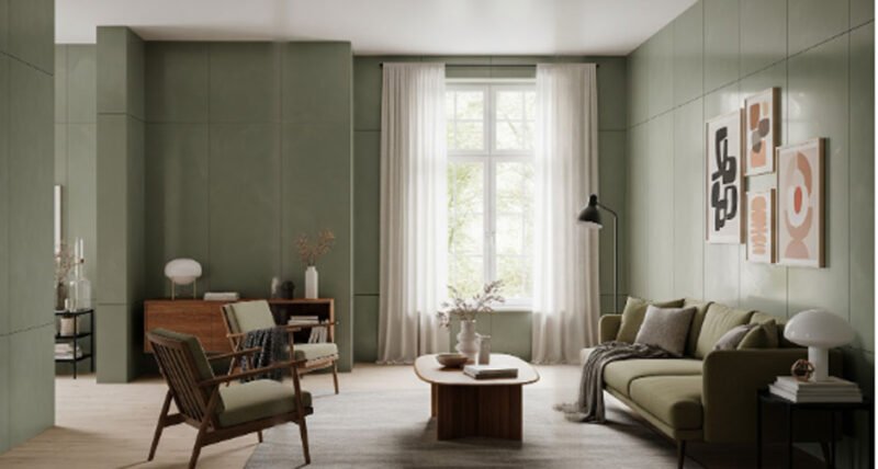
Exploring Earthy Colours for Natural Warmth
Earthy hues still influence interior design. In lounges and dining spaces, tones such as moss green, olive, ochre, and brown provide a grounded energy. Earthy colours add texture and richness to cabinetry, wall panels, and storage spaces. The feeling of organic harmony is strengthened when these colours are combined with stone surfaces, woven textiles, or warm metals. Earth tones are dependable options since they work well in minimalist, rustic, or modern settings.
Adding Bold Shades With Careful Placement
Bright colours can completely transform a room when used effectively. Vibrant colours are useful in rooms with abundant natural light, as they help avoid a heavy perception. Emerald green, deep orange, or bright turquoise would also be good accent colours for doors, bookcases, and recessed areas. Although these tones are balanced with the surrounding neutrals, they make the atmosphere lively. Bold colours also shine in children’s rooms and in their creativity studios, where expressive palettes are natural and inspiring.
Coordinating Colours Across Rooms
When homeowners identify repeated undertones, colour cohesiveness becomes easier. A house may have brown accents in the lounge, green accents in the kitchen, and blue accents in the bedroom, yet a typical soft coolness or subdued warmth can connect all three. Transitions can be made more organic by paying attention to how rooms are connected through open doorways. To promote unity without rigorous matching, wall panels, furniture, and fabric selections may softly repeat particular colours.
Considering Lighting Before Finalising Choices
Lighting significantly affects how colour is perceived. When artificial lighting is used at night, a shade that looks gentle during the day may become deeper. The final palette will function consistently throughout the day if tones are tested under various settings. Another way to avoid surprises is to pay attention to how shadows fall on accent colours or wall panels. Warm bulbs enhance earthy or pastel hues, whereas natural light accentuates cool tones. Taking lighting into consideration helps homeowners accept popular colours more comfortably.
Colour Trends Used With Confidence
When utilised thoughtfully and carefully, trendy colours improve interiors. Homeowners can create cohesive, expressive designs by blending accent walls, wall panels, and different colours across various spaces. When carefully positioned within a larger palette, each trend-driven colour gains meaning. Your house reflects changing trends while remaining rooted in individual taste, thanks to a methodical approach.